
Day by day, the design field in the web and mobile development is evolving which means the way developers are working continues to change alongside. With that comes new trends, methods, and systems that aim to make workflows clearer and launch new products faster. And here is one of those ways. Let's talk about Design Systems and their role in a company.
What is the design system?
Design System is a comprehensive guide for project design, in other words, it's a collection of rules, principles, patterns, and best practices. The core element of each Design System is often a UI Components Library. Developers and UX/UI designers can use them as building blocks to create new products or services. A key benefit of the Design System sounds clear: your team is saving time due to using the ready core design and functionality of each design component. Those components include color schemes, input/output fields, links, forms, and other visual elements.
This idea was born around 10 years ago, during a major shift in the types of products and services being designed and the platforms on which they were delivered (mobile development was getting more and more valued). In response to these changes, Brad Frost - web design and speaker from States, formalized his ideas into the Atomic Design framework. His idea which is described in the book of the same name is to establish a framework that UX designers could build upon and use repeatedly. As the author claims, it discusses the qualities of effective pattern libraries and showcases techniques to transform development workflow.
The next step was made by Google. One of the early design systems that made a big impact on the market is their Material Design, presented in 2014. Google attempted to combine the best practices from both early pattern libraries and Brad Frost’s Atomic Design ideas.
More recently, design systems are sweeping the tech world right now, with digital giants like Shopify, IBM, Atlassian, Airbnb, Microsoft, Audi, and others.
Some of the best examples in the market
Shopify
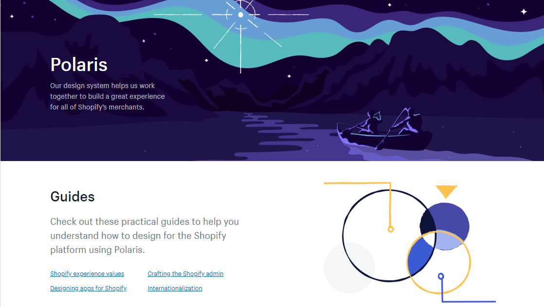
Polaris is a set of comprehensive guidelines and principles that developers and designers can use while building apps and channels for Shopify. It was developed for all Shopify merchants and their customers to benefit from a unified store design. The Polaris system includes all the building blocks needed to create apps that won’t require a learning curve. Plus, it allows partners to download a library of components and patterns, and a style guide. For those who want to design with Shopify Polaris, there is a possibility to download the Sketch UI kit and React components from the main Polaris landing page.
Atlassian
Inspired by Apple’s Human Interface Guidelines, Atlassian - a software company that is best known for Jira - has decided that its design system needs to be based in code while maintaining ease of use. The accessibility is the most important factor for Atlassian and their design adheres to standard contrast ratios that ensure users with low vision can see and use their products. All the foundations, components, and patterns are well-described on their landing page.
Mailchimp
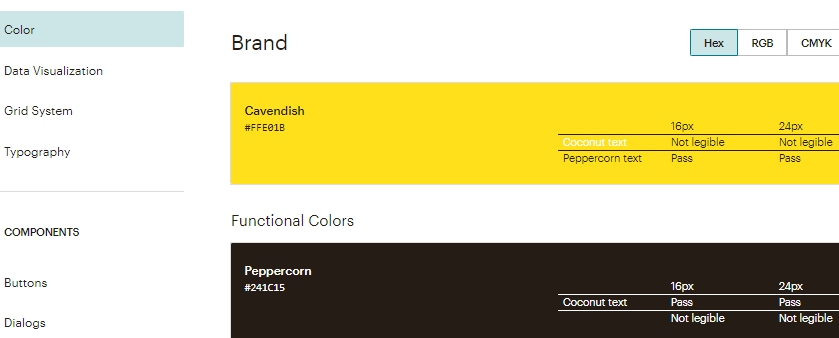
MailChimp is an all-in-one marketing platform, widely known as an email marketing service for small businesses. Their Pattern Library consists of 2 parts: foundation (color, data visualization, grid system, typography) and components (buttons, form elements, own-branded freddicons, and others). As the Mailchimp team claims, the main goal of this is to provide a consistent structure to design language. And this works well. Together, Mailchimp's design system, as well as their platform style, are creating a unique Mailchimp identity.
Audi
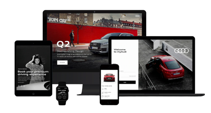
Audi user interfaces are based on three principles of the Audi look: variety, honesty, and balance. To follow this rule, the company has created own Design System that we can describe as well-structured, comprehensive, and easy-to-use as it includes basic components, modules, and animations. The visual kits are divided into categories which makes them easy to find. Moreover, Audi provides guidelines and descriptions with real examples to each category.
Microsoft
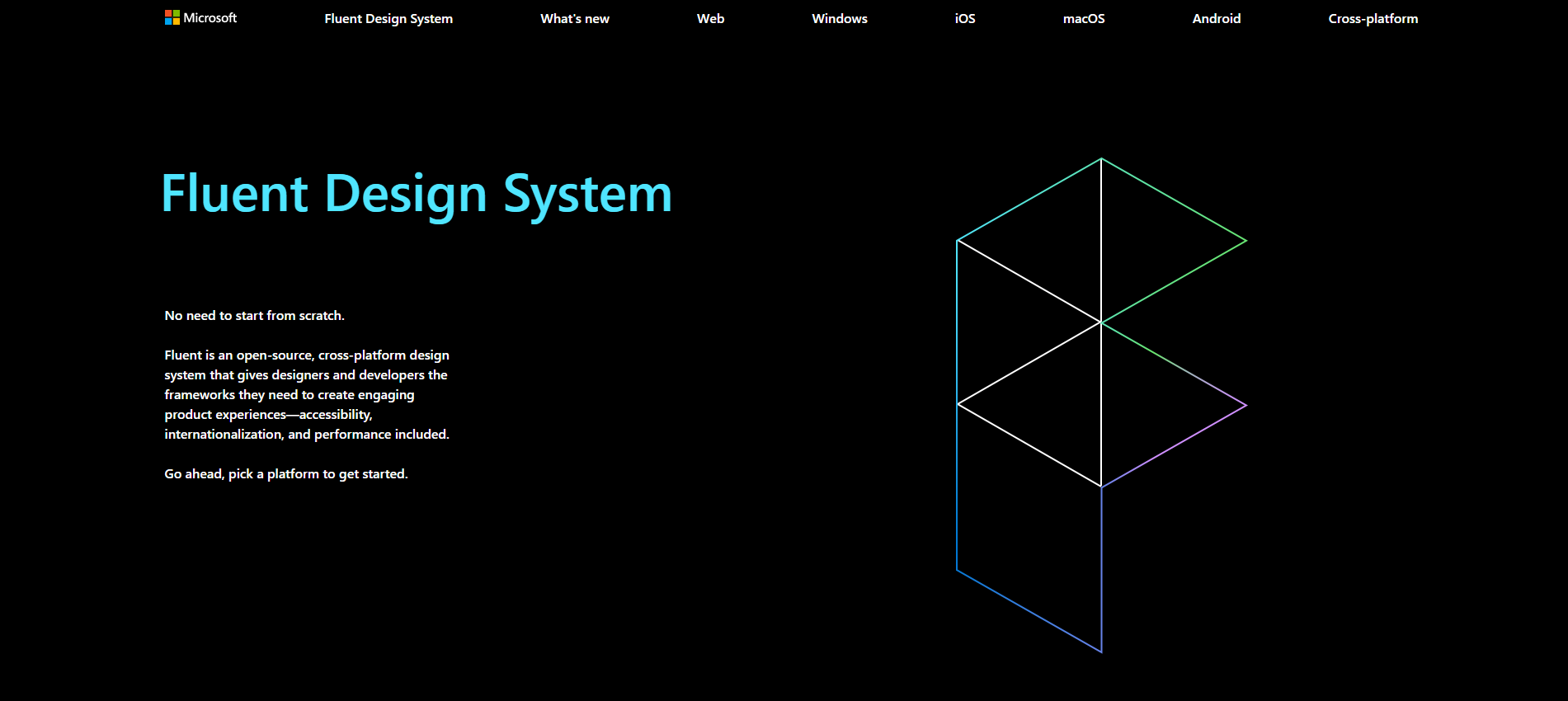
During the Build developers conference in 2017, Microsoft officially released its Fluent Design System that was previously known as Project Neon. Fluent is a new design language for Windows, and these design guidelines are supposed to be an evolution of the Windows 10 UI look. Fluent takes a more artificial approach to design, mixing plastic-like translucency with 3D effects and with new transitions between different application states. Microsoft talks about Fluent being based on five components: Light, Depth, Motion, Material, and Scale.
IBM
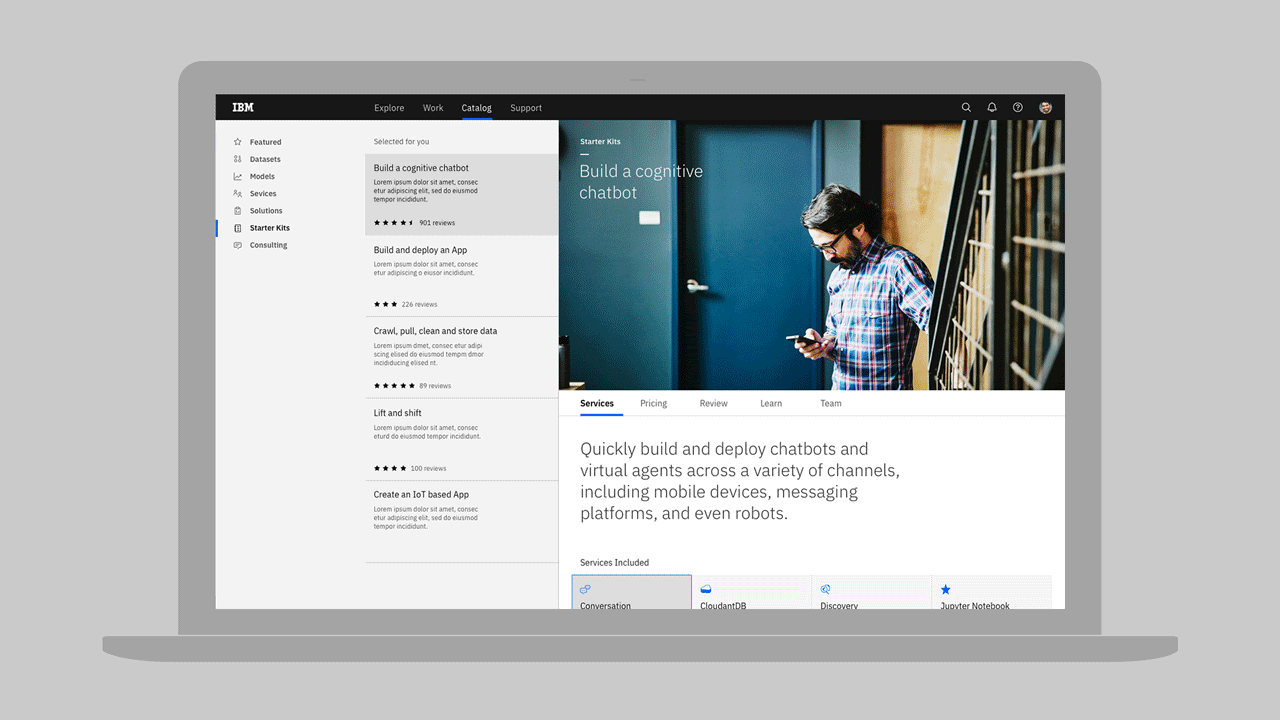
IBM Design Language provides guidance on how to communicate with the IBM brand and establishes a visual framework for all IBM products. By its core, IBM promotes itself as a medium between mankind and technology. Their Design System was created particularly for those who are working with IBM branded products and services, that's why it is not providing a wide range of assets, however, the basic set (such as color palette, grids, and icons) is presented.
Carbon
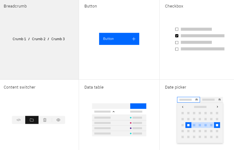
Carbon Design System is an open-source set of visual, user experience, and specifications for the IBM Cloud platform and services offered there. Unlike own Design Language described above, IBM has included rich visual design kits to Carbon that enable an efficient design process. Together with the visual and user experience guidelines, you can find there complete front-end code kits for Angular, React, and Vue for boosting the development process.
Why does your company need a design system in 2020?
A unified company brand strengthens its value in the minds of the customers, suppliers, and other shareholders. In the context of Design, this can be presented as a definition of the visual patterns, including color schemes, typography, and icons. If you have a large company with many different teams that are working under the same brand but for different products or services, then a design system could be a great investment for everyone involved. The unification performs several tasks at once:
Improve UX and customer satisfaction due to standardization.
Increase brand awareness through a single visual style for all projects.
Know how to use a component or pattern properly. This can also simplify the process of transferring a project to another design team (outsourcing, for example)
Increase velocity and time to market. By breaking design elements into simplified components, design systems make the whole process more efficient. Creating mock-ups and prototypes with a ready-made library takes less time, as well as ready-made patterns speed up testing.
How to implement a design system?
Evaluate your current UI inventory and note everything you’re designing. This makes understanding your needs easier by placing all your assets in one location.
Create core principles for your product. It's one of the most crucial and pillar moments of design systems creating. The principles should be endorsed by your designers and developers as they will work with it on a daily basis.
Choose a visual language (or visual appearance) and functional behavior (or code). Everything visually conveys a message. It's important to understand that perception is influenced not only by individual elements (text, colors, typefaces, buttons) but also by the relationships between those elements. In other words, it’s not enough to use colors and fonts independently; we should also be aware of the right combinations that make a product feel a certain way. Patterns and components are forming the language of a product’s interface. Therefore, a design system should contain not only patterns but also techniques and practices for iterating on those patterns.
Create patterns, components, and graphic design assets. A well-made design system allows intuitively to drag & drop visual components right into a new prototype or mock-up. The development of reusable components and patterns in your design system can be named as a final form and is what your end-users will interact with. All of the steps previously created are leading to this point.
Upload the select UI elements in a design system document. Documentation and standards - this is what separates a pattern library from a full design system.
What design system you should use?
The only way to get started building a proper design system (if you have a design team that is ready to spend enough time for it, of course) is to follow the step-list above. If you would like to check real-life pattern libraries and find inspiration, there is a great resource to bookmark called Website Style Guide Resources, which has examples from a wide variety of companies and private contributors that have put their style guides, pattern libraries, open-source design systems online for the public. For those who don’t want to copy the existing style, there is a different option.
Designers all around the world create own versions of design systems, based on Atomic Design methodology, that can be purchased online. It means that you can pay for a license in order to use the customized library, patterns, and other components for individual and commercial purposes.
And the main - professional advice can always help to make the right choice, review a current Design System, and even created a better one based on your requirements. With more than 50 projects completed, we know what great design means.
A final note
Design Systems allows the team to design, develop, and maintain the quality of existing and new products. To conclude the above, let’s note the main bullet points of what makes it useful. From our perspective, an effective Design System should:
Improve user experience. Happy customers always come back.
Take your team’s feedback (both from developers and designers) into account. It should ultimately serve your team and help streamline their processes.
Be implemented for all products. No matter if we are talking about one landing page or the whole complicated software, the visual code should be the same.
Represent the company's value in a visually cohesive way.