
Understanding users is important to every business - providing an ideal user experience (UX) is equally important to success. After all, your product’s goals depend on users being able to and wanting to, stay around long enough for these to happen.
So how can you tell if your product is working as intended? Many companies make the mistake of creating imaginary, hypothetical user paths and not focusing on reality. The answer to this is user journey mapping - specifically in regards to UX and how people navigate through your brand or service.
User journey mapping can visualize your existing data, pair business goals with current statistics, and find key areas for improvement on all of the above. Here’s how user journey maps work, why they’re important, and how you can get started!
What is a user journey map?
A user journey map visualizes how individual users engage with a service; it covers everything from the very first contact or interaction, through to advanced engagement and long-term loyalty.
User journey mapping can cover virtually any digital product, from websites to applications, and is most typically shown visually. Generally, it shows the user flow through the service, showing how and where they first use the app, charting their progress into more advanced features as time goes on. Along the way, it highlights how users feel, what they are struggling with, and how close they are to achieving their own goals.
Key components of a user journey map
A typical user journey map marks all touchpoints between the user and the product/business. User journey maps can also mark details regarding specific channels; such as if your service is available on multiple platforms, for example.
When it comes to user flow, you can mark various different aspects:
Websites - if your user journey mapping is for a website, you can track which pages are being used, as this indicates where your users have the most interest (or can easily navigate).
Mobile Apps - similarly, an app can track which functionalities are being used to determine what features are the most useful for the customer.
E-commerce - online stores can track the checkout process to learn how and what shoppers purchase.
Dashboards - if you’re using an analytical dashboard, learning how it is used (which functionalities, views, navigation, etc) can help in further improving its performance.
Third-party integration - such as email or social media, this can also be tracked to see how much it is being used.
In addition to these touchpoints, user journey mapping also seeks to provide information on the customer's goals and motivations - why they are using your app or service in the first and what encourages them to take each next step. Where possible, this can also include their feelings (based on feedback or research) to show where they are happy and where they may be frustrated (an area for improvement, of course).
Why is UX journey mapping important?
UX journey maps are important because they clearly visualize how a product is used and for how long. It enables designers and developers alike to see the service from the customers’ point of view; to see what is most loved and what key frustrations need to be removed.
All of this leads to a user-centric process, as the journey map UX approach ensures future decisions are made with the user’s experience in mind.
Ultimately, all businesses want their users to engage with the product in an ideal way - whether it’s as quickly as possible, or on a larger scale or simply in greater numbers. By visualizing the user journey, businesses can find potential solutions to these goals. They can look into removing unnecessary steps, address other needs, or simply streamline the entire process.
Similarly, UX journey mapping is also vital for multi-tenancy software - that is, applications with different types of users. Accommodation apps like Airbnb, for example, have both guests and hosts to consider. As such, there should be two separate UX journey maps for these users. Ideally, both should have a great experience as, if only one finds it easy to use, then the final service will suffer. Such mapping will highlight if any changes impact or benefit both users, helping to make better decisions.
What is the process of user journey mapping?
There are many ways to create a user journey map, depending on your needs, how much information you have (or are able to) gathered, and the amount of detail you wish to explore. More extensive user journey mapping will, of course, require more work to set up.
Nonetheless, here’s a broad 5 step process to get your UX journey maps ready.
Choose Personas & Scope
Before you begin, you first need to determine what it is you wish to track. Defining personas (ideally based on business targets or existing research/usage statistics) will give you a certain number of options. Do you want to target all users, or separate it by some factor?
Earlier we mentioned multi-tenant applications and, in such situations, multiple personas are needed in order to track them separately. However, even singular-tenant products can track users by age, location, or any other demographic factor, if it’s important to the business. Are you noticing large usage in one demographic, but not another? UX journey mapping might just indicate the differences between them.
Once you have all of this, you can then focus on the scope; do you want to track users across the whole app, or just key sections? This ultimately depends if you want to improve the entire product or the features most in need of updating.
Create User Scenarios and Expectations
After user research and assigning personas, you next need to determine their scenarios and expectations.
When you order delivery, you have a need and expect a quick result. Nobody wants to wait 2 hours for a pizza. A scenario is the need or desire they are facing, such as being hungry, while the expectation is what the user expects to happen - i.e, not wanting to outside and not wanting to wait too long.
For a much broader business example, let’s assume you have an HR or recruitment application. Other than recruiters, a user might be:
Looking for any job, with a priority on starting work as early as possible.
Searching for a specific job (perhaps they are already employed and looking for their next step up) in a certain location or industry.
Assessing potential companies to consider.
Considering a career change and wanting to see what jobs they’re potentially applicable for.
Each of these could be a possible scenario to set-up. Each would have its user flow, too.
The goals would also vary. The first two scenarios would both expect to be able to apply for jobs as easily as possible, yet the first wants to find jobs quickly, while the second wants more control or filters in terms of how they search.
The third and fourth, however, don’t want to necessarily apply. They may simply want to set-up notifications or updates (a form of engagement your UX journey maps can track). The last, in particular, want to be able to upload their CV and see what options are recommended. In time, they may have another scenario, but this is their current expectation and defines how they will value your company and service.
Create Touchpoints & Stages
Every time a user engages or otherwise interacts with your business or service, that’s a touchpoint. To create a user map, you need to assess all key touchpoints across the various channels that your product has. This includes logging in, accessing different pages/views, utilizing different features, etc.
In the HR example given previously, we can consider searching, filtering, applying, setting up alerts, and uploading CVs as key touchpoints, among others. Here, you can track active engagement to further refine your user map against company expectations.
You might also want to label stages as well - these are the parts of the user journey from the users' side. For example, moving from browsing to shopping to ordering. This, paired with your touchpoints, will show you how users actively progress.
Consider a user's emotional state and pain points
We talk about user needs at the very start, as this is their end goal, but they also have micro-needs or pain points along the way. For instance, if something is difficult to find or accomplish, then that is a pain point users need to overcome before they can continue.
For example, this is the reason many food deliveries or taxi apps allow users to create orders without having to call. Even though they have a phone, making a call was determined to be a significant pain point (it went against the initial expectation of speed, among other factors) and making it optional, rather than necessary, greatly improved user flow to the point that it’s now a standard in these industries.
Likewise, you should also consider the emotional state a user might have at each step. You might not find too much about this during your research, but you should apply as much logic here as possible. Is a user happy or frustrated? Even if they don’t tell you, there might be some telltale signs. If the majority of users are logging off, closing the app, or otherwise dropping out at a certain step, this could easily indicate some sort of anger at your app.
Put it all together
Now you have everything you need, you just need to visualize it! So, how can you show everything that you’ve collected?
The easiest option is to create a timeline. This is done for each persona, so include all the details researched in the previous steps here as well. Timelines work because, not only are they easy to interpret from a human perspective, they can also then track the changes of all other factors, from user thoughts to emotions and engagement levels, along with the same timeframe.
You can start from where the user first signs up, making note of how they came to your service, what their feelings are, and what their goals are. From here, you can chart all the key touchpoints in order (measuring the gaps in time, if possible), moving the ‘line’ itself up or down in regards to how the user is feeling.
However, the best user flow isn’t always a singular storyboard, as you may very well find users have multiple ways of achieving the same process on your website or app. For example, if a user applies for a job in an HR app but has yet to upload a CV, they have to go through additional steps that others do not. If you decide to track multiple paths, make sure you track the percentage of people that go both ways (and hopefully join back up anyway). If this happens enough, it might actually suggest a separate persona to consider.
This is where more personas or demographics can prove useful. Are certain groups having a much longer user flow than others? Perhaps some have to go through more steps? All of this shows key insights that you can evaluate against your business goals.
Examples of good user journey maps
Good UX journey maps are hard to find, as they are very rarely shared publicly. That said, here are a few that offer great insights into how companies assessed and improved their service.
Carnegie Mellon University & Travel Mate
Carnegie Mellon University attracts students from all over the world but has limited support on their website. Travel Mate was designed to meet these needs and one designer documented the extensive user journey mapping along the way.
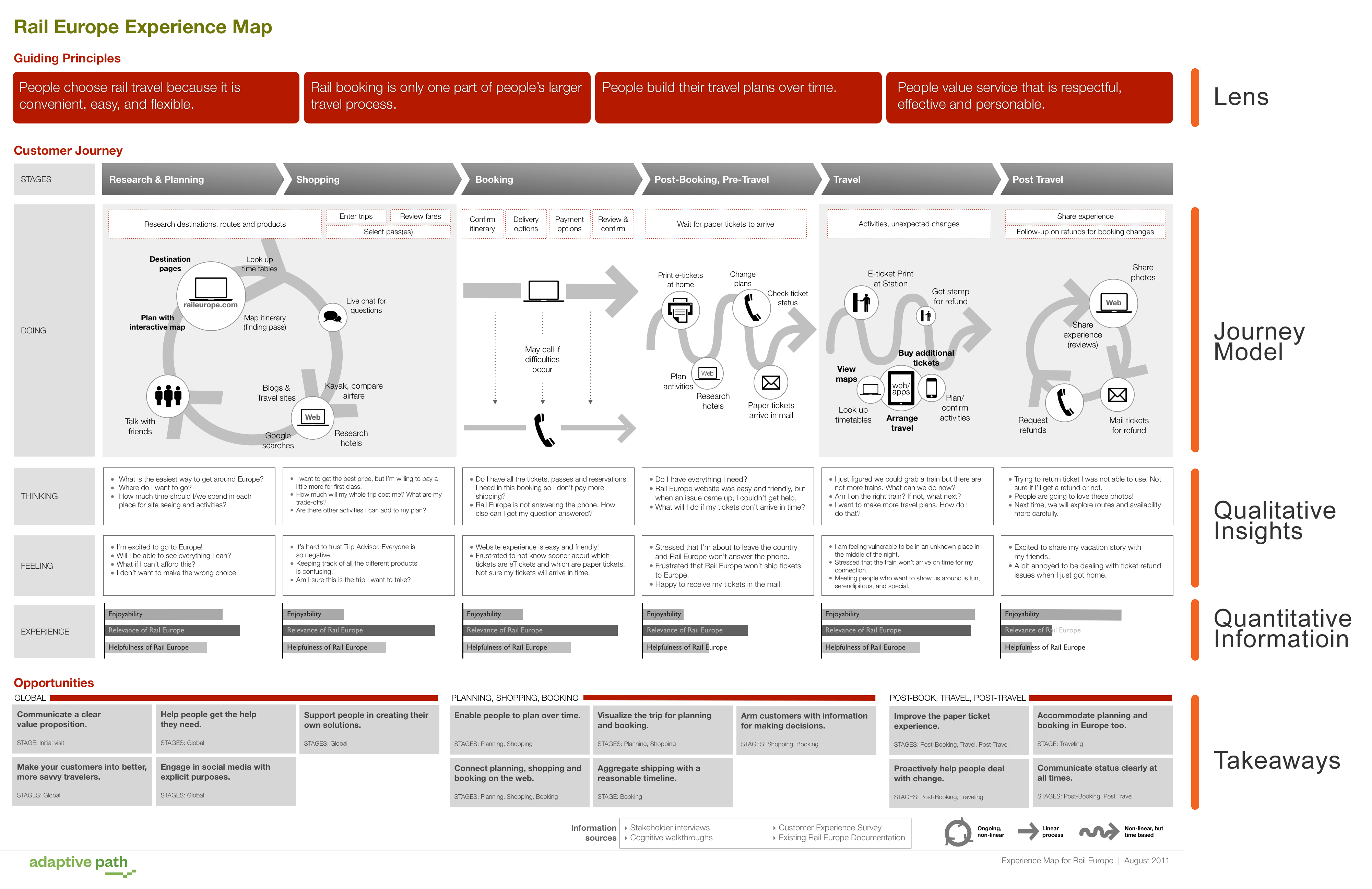
Rail Europe
This is a similar example, but one that’s quite broad in scope. The many user stages can be seen, along with information regarding devices and touchpoints. They also include information on thoughts and needs - the user's goals, emotions, and pain points.
Lancome Paris
Lancome is a Parisian company specializing in beauty products, such as makeup and perfume. As such, rather than focus on a particular service or product, they created a brand user journey map. While it’s not specifically about a digital product, you can nonetheless see how the user's emotions and struggles are clearly detailed.
Why is this important? Because your product might not exist in a digital bubble. Maybe you have physical stores, advertising, or other external engagement. Don’t be afraid to bring this into your UX journey mapping if it’s relevant.
Let’s Get Started
That’s all there is to it! While it does involve a lot of research, UX journey maps are one of the best ways to visually present all of the information you’ve gathered. They can be used to compare different personas, to highlight areas of the highest and lowest engagement, and more.
In other words, if you want to ensure there are no problems in your UX, or even find areas of improving an already working system, a journey map lays everything out in front of you.


