“If you think good design is expensive, you should look at the cost of bad design”
Dr. Ralf Speth, CEO of Jaguar Land Rover
Great UX design is essential for usability. As such, choosing a designer is important. Companies aren’t just choosing someone to work with, they’re choosing their overall UX strategy and results.
In other words! Your portfolio needs to stand out. Here’s our quick guide on what to include, followed by some of the best UX portfolio examples we’ve found along the way!
Why Are UX Portfolios Important?
A UX designer’s portfolio is intended to highlight and showcase the very best of UX designers' work. It should include real projects, as well as anything that shows off their skills, diversity, and range.
This is important because it’s better to walk the walk than just talk the talk. A CV can only say so much; sooner or later, actual results are needed.
“Creativity is allowing yourself to make mistakes. Design is knowing which ones to keep.”
- Scott Adams (Author of Dilbert)
As a UX designer, your portfolio should exemplify your creativity, capabilities, understanding of UX concepts, and more. While it’s a retrospective of everything you’ve done and learned - the best of the best - managers want to see how you got there. This includes the thought process and scrapped designs that lead to the final result.
However, it’s also not just designs. It’s where you can demonstrate and explain your design process. UX designers need to focus on the user-centered design process. Your portfolio is where you convince people.
What Do Hiring Managers Look For In A UX Portfolio?
There are a number of essential factors that appear in the best UX portfolios, including those we’re about to show you. These are:
User Research - Companies want to see the research behind your designs, so demonstrate the work which has been done before you even started to think about the product itself (PS. including reports is always welcome if possible).
User flows and user stories - A core understanding of users is essential. User stories aren’t about your designs. They’re about putting the product in the context of addressing a user’s problems or needs and business goals. As a UX designer, you should be able to demonstrate how the final experience was planned.
Sketches, Wireframes, and Wireflows - these are used at the early stages of a design and it’s vital to show that, as a designer, you understand this stage and can clearly test new approaches through more ‘detail-light’ methods.
Prototypes - You can also call them ‘designs’. Not every prototype gets released as a full product, but they show the ideas that were tested and refined.
User Testing - Managers don’t just want to see how user testing was conducted; they want to see how you adapted to the results and lessons gained.
Final Products - of course, real results speak for themselves. The portfolio of any seasoned UX designer should include the very best designs that made it into their final products.
Other than that, here’s a pro tip: include a retrospective. For each project, don’t just include the above criteria - also add your commentary and explain each challenge solved, each innovation created and every lesson learned.
The Best UX Portfolio Examples!
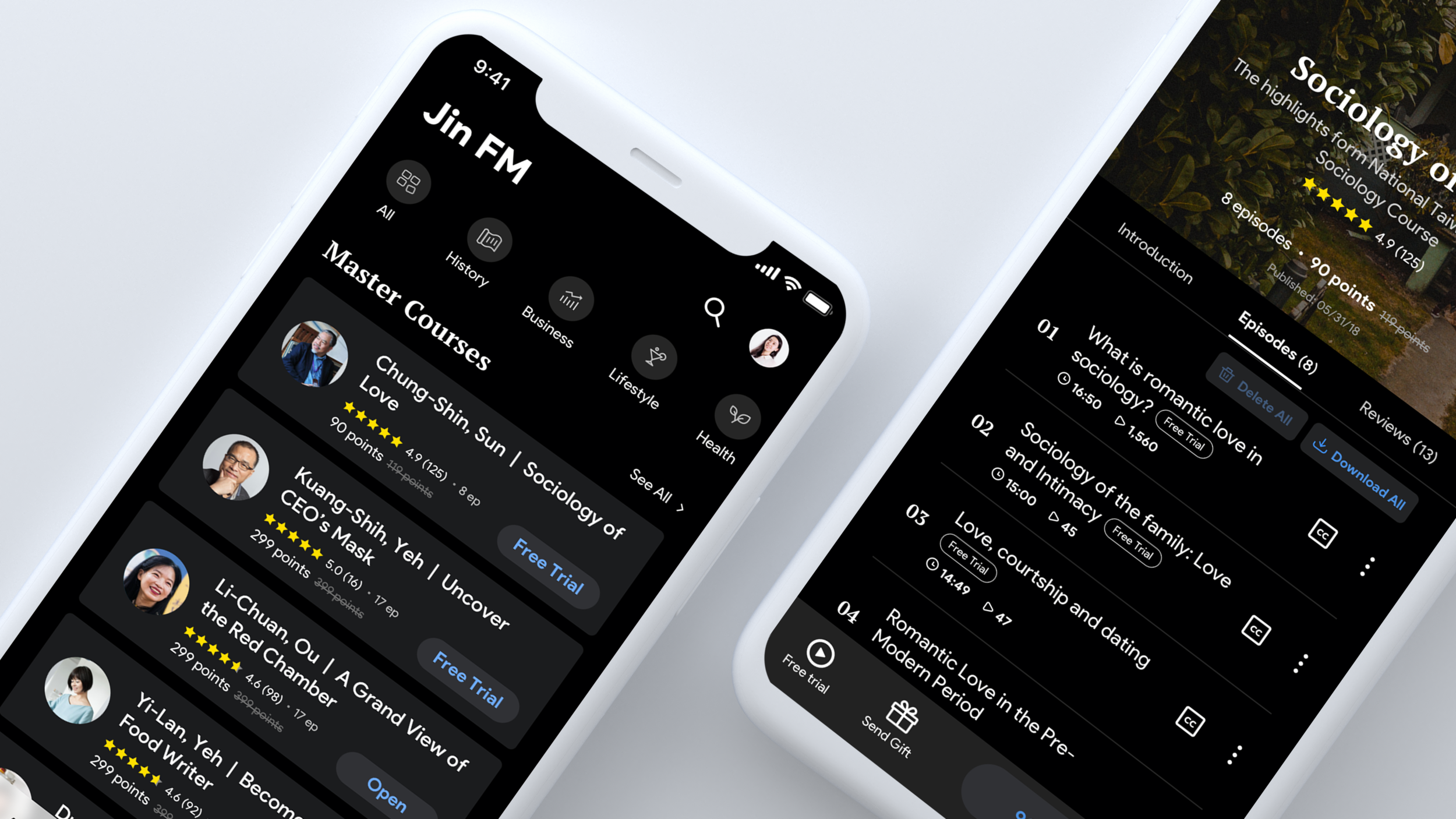
Yun Shu (Jin FM Podcast App)
This is a brilliant example of how to walk someone through your role in a respective project. Here, UX designer Yun Shu highlights the scope of the work - including the challenges, scope, and results - before exploring the entire UX process.
Here, there is a clear demonstration of iterating based on feedback, alongside a substantial documentation process. By the end of it, there’s a clear understanding of Yun Shu’s involvement and their attitudes/capabilities as a UX designer.
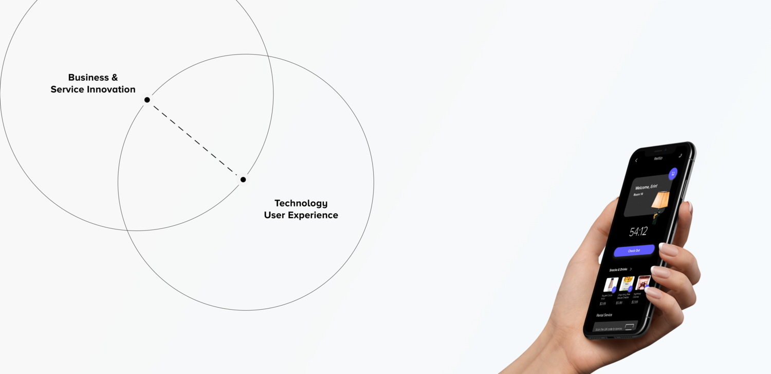
Rest Up (Erin Xie)
Here’s a lesson in how to present your portfolio - if you’re a UX designer, showcase your UX skills in the studies themselves! It’s why the best UX portfolios (like every item on this list) use their website.
Here, Erin Xie uses animations and images to explain many of the concepts in this respective app. It’s a real ‘show don’t tell’ approach that ensures the project is fully understood. For example, the user story is presented as a storyboard, exploring the concept and how the app fits as a solution. It’s simple, yet elegant.
Josh Glucas
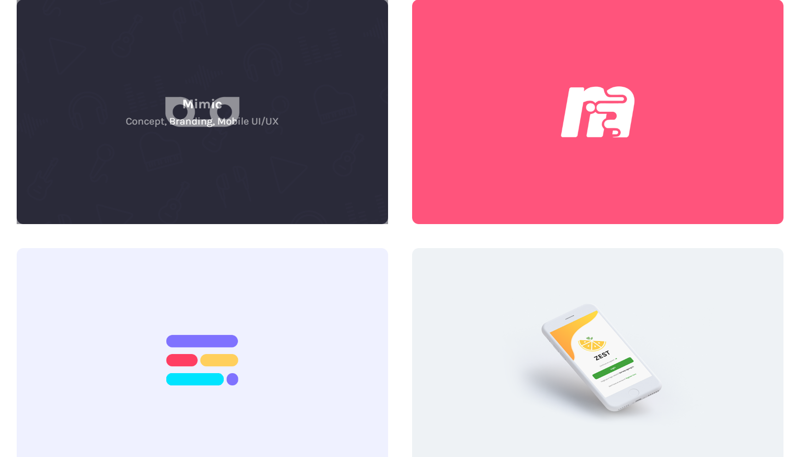
Earlier, we said that a portfolio should highlight the best of your work as a UX designer. Curation is a skill in itself, and Josh Glucas shows that well here. From the opening statement, Josh goes on to highlight 4 key projects and, what’s more, he quickly identifies the various tasks demonstrated in each before clicking over.
We recommend taking a look at Mimic, as it’s a perfect example of the market research and wire flow efforts that go into any great product, and Convene, which focuses more on planning and preparation.
Other than that, Zest is quite insightful, as it focuses on a mobile-only role. We like it because it includes the initial assumptions (an important part of any Project Requirements Documentation) and hypothesis statements that informed subsequent decisions/designs.
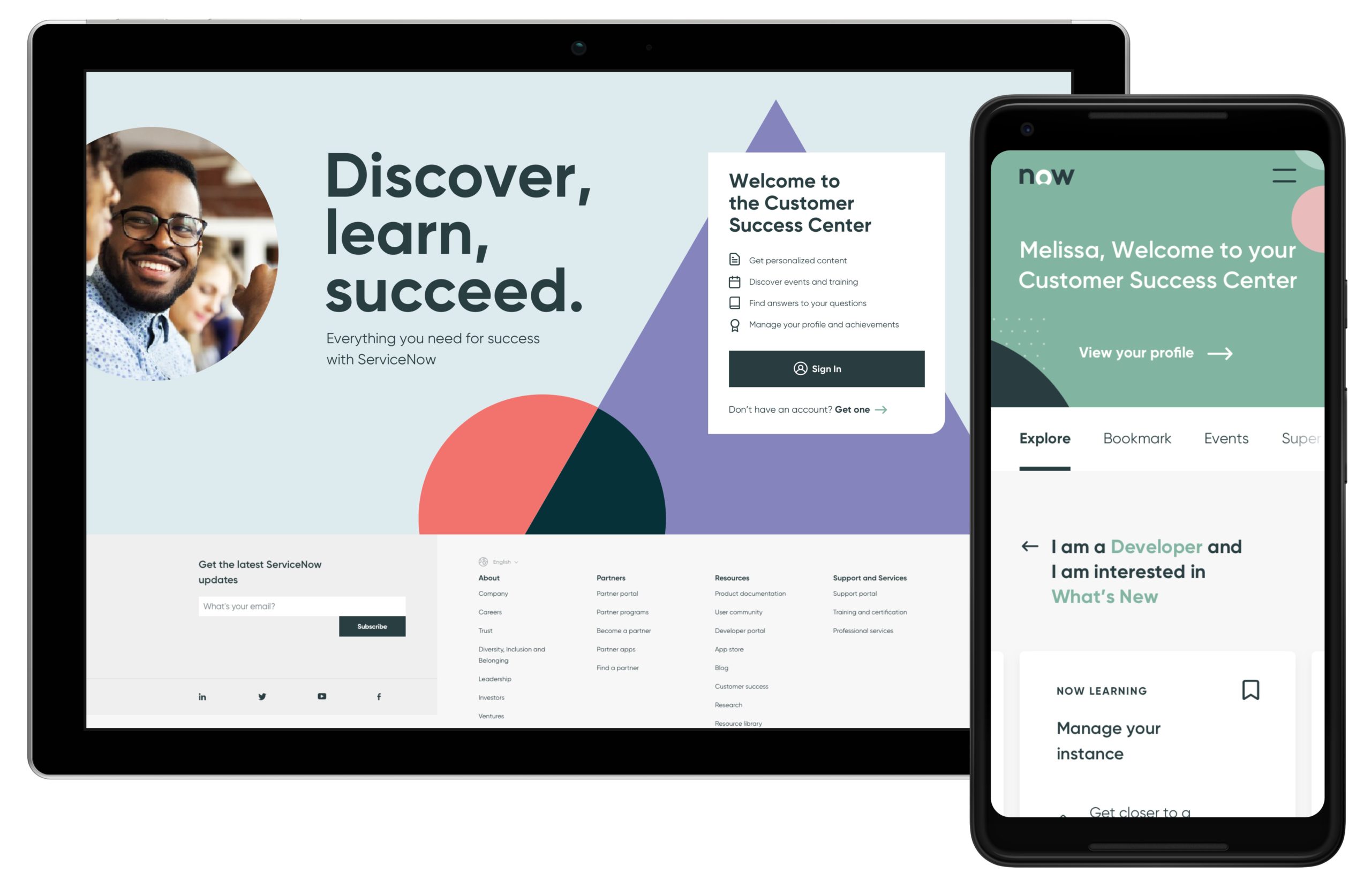
Monica Thy Nguyen (ServiceNow)
This portfolio has many great examples, but the ServiceNow app is perhaps the best example here. It has everything we love, from a clear thought process to a thorough understanding of user roles shaping every UX design choice.
However, what also stands out here is the use of photographs of the team at work. While many portfolios show walls and other ‘backstage’ views, the direct inclusion of people here really lets potential managers see Monica’s involvement in the team.
There is also a presentation of a prototype, too. The short recording showing a prototype that is ready for user testing is a nice addition!
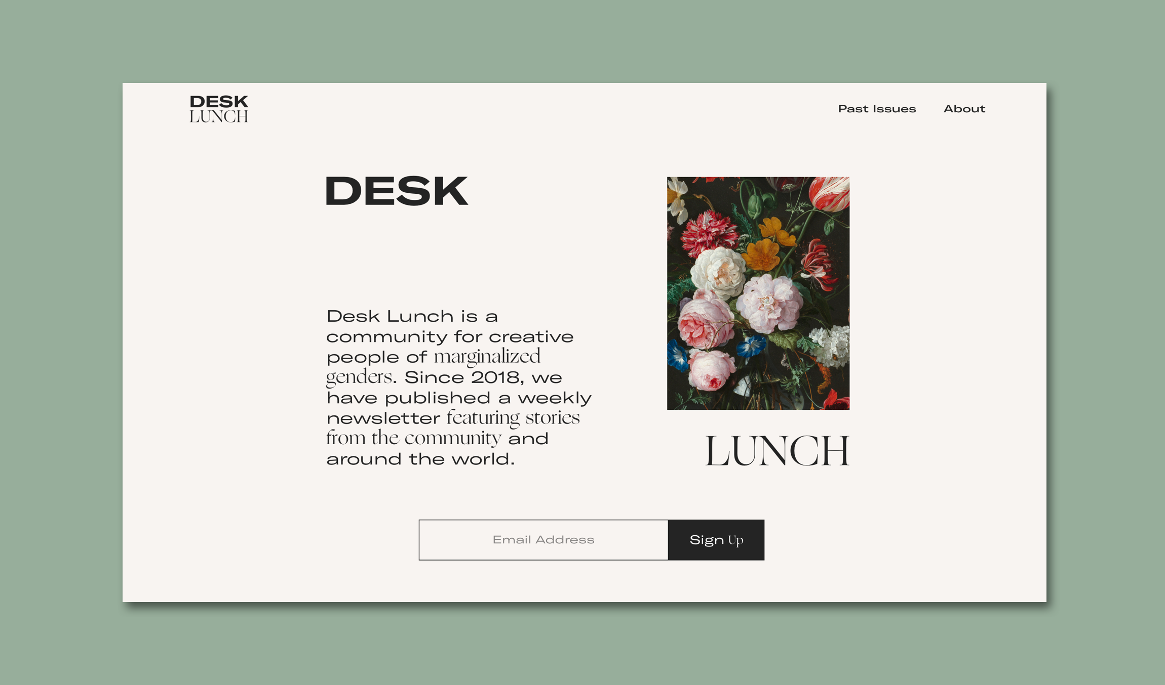
Liz Wells (Desk Lunch)
Not everything is pretty and, while many UX designers may be tempted to hide these parts of their work, they’re often a required part. After all, research and initial sketches can often be messy but, as they shape the final project, it’s something that should be shown in a portfolio.
Lizy Wells does this fantastically in this portfolio. Looking at the Desk Lunch project, for example, we see a very creative way of showing her layout sketches. Taking something necessary to show and transforming it in a visually pleasing way is another UX skill in and of itself - and it’s demonstrated well here.
Of course, we can also see a lot more of the thought process at work, including color options and other designs that weren’t ultimately chosen. It all goes towards gaining an understanding of the design process and the reasons behind the final product.
Simon Pan [Amazon Prime Music]
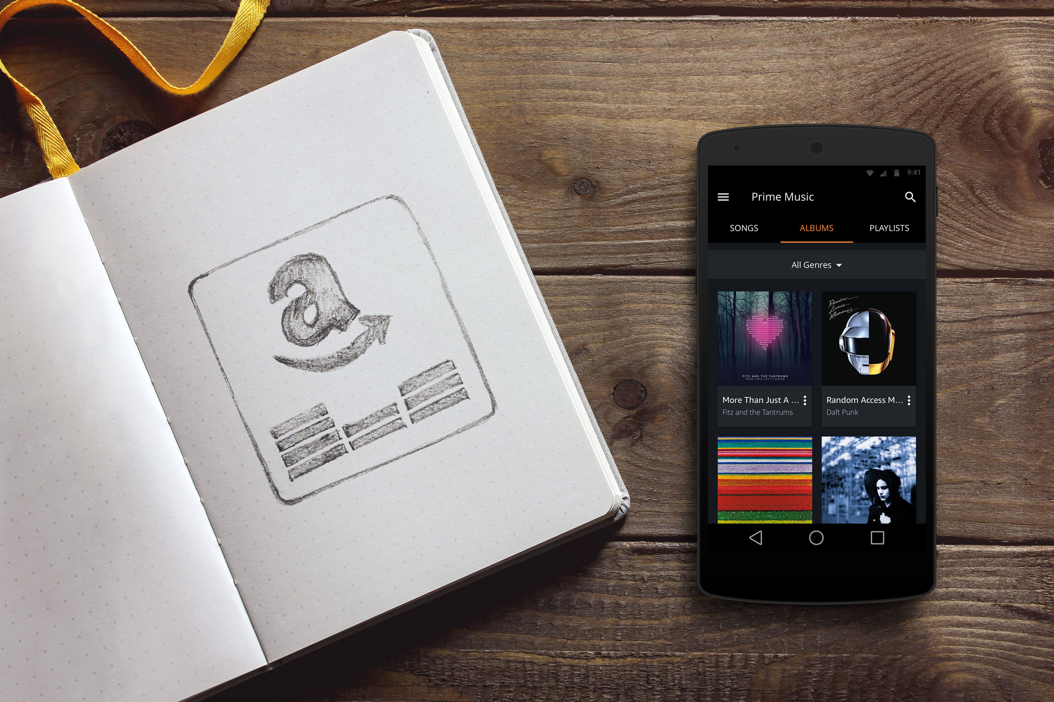
A UX Portfolio has to do a lot, but it also has to do it coherently. This is not unlike UX work itself, which is why we appreciate Simon Pan’s walkthrough of the Amazon Prime Music app. Simon talks about the app's goals and objectives, before launching into a clear and confident understanding of user needs - all visualized whenever possible.
What stands out here is the demonstration of themes, features, and concepts that show the design process that went on behind the scenes. This confidence comes across well because the portfolio backs it up. It clearly states “this is how it’s done”.
Aileen Shin
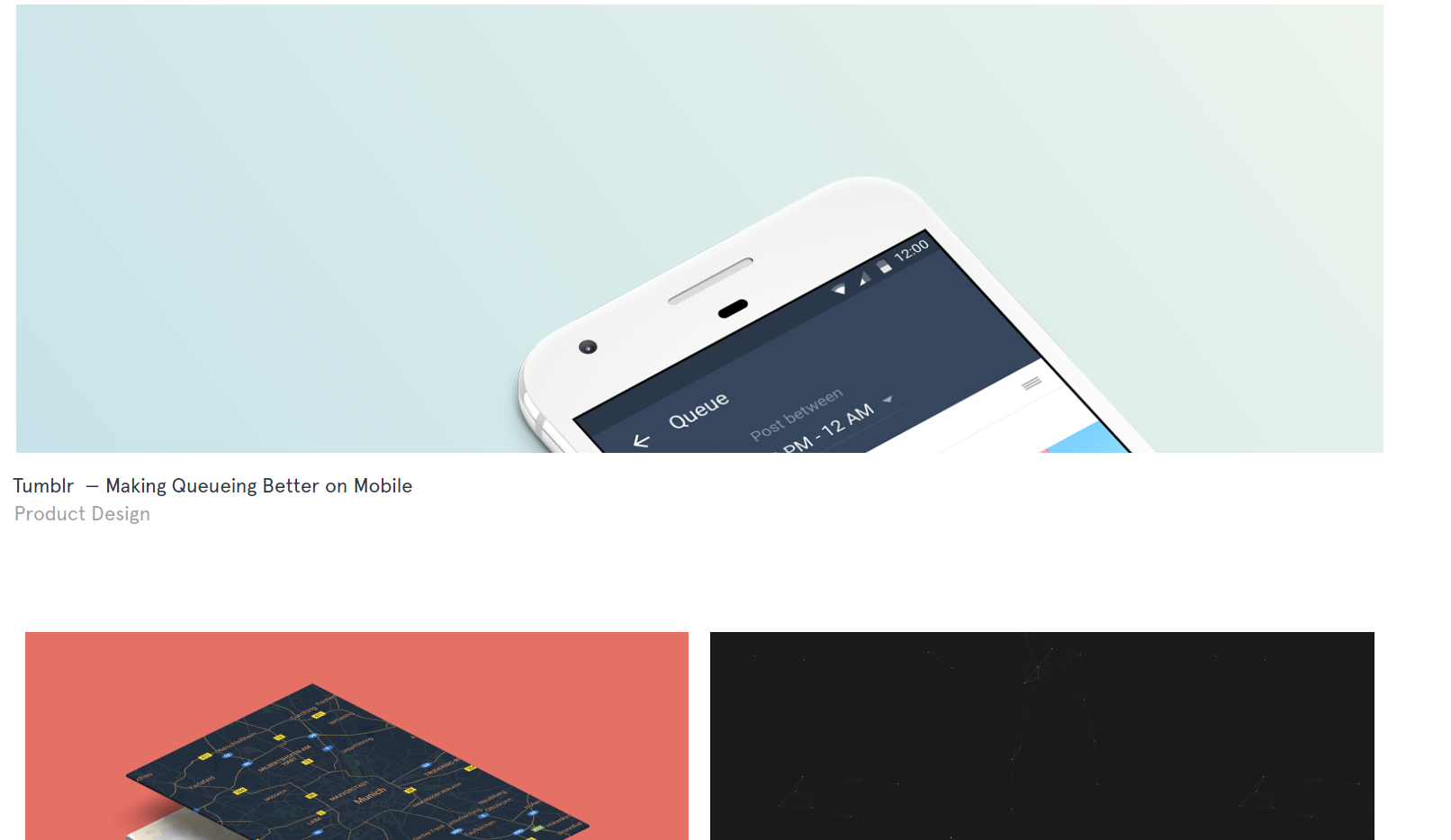
We’ve mentioned earlier that the user flow is important. It’s no surprise then, that many UX designers keep their navigation clear and simple, but Aileen’s portfolio takes this to a new level with just two pages when you land on the home screen. The extra-tough here is the strikethrough on each page to indicate which one you’re on. It’s a subtle touch that speaks volumes about the designer.
The individual projects also back this up. The Tumble study is particularly insightful, as it shows Aileen’s role in updating an existing product, rather than creating something from scratch. This brings its challenges, all of which are addressed here.
Ivo Mynttinen
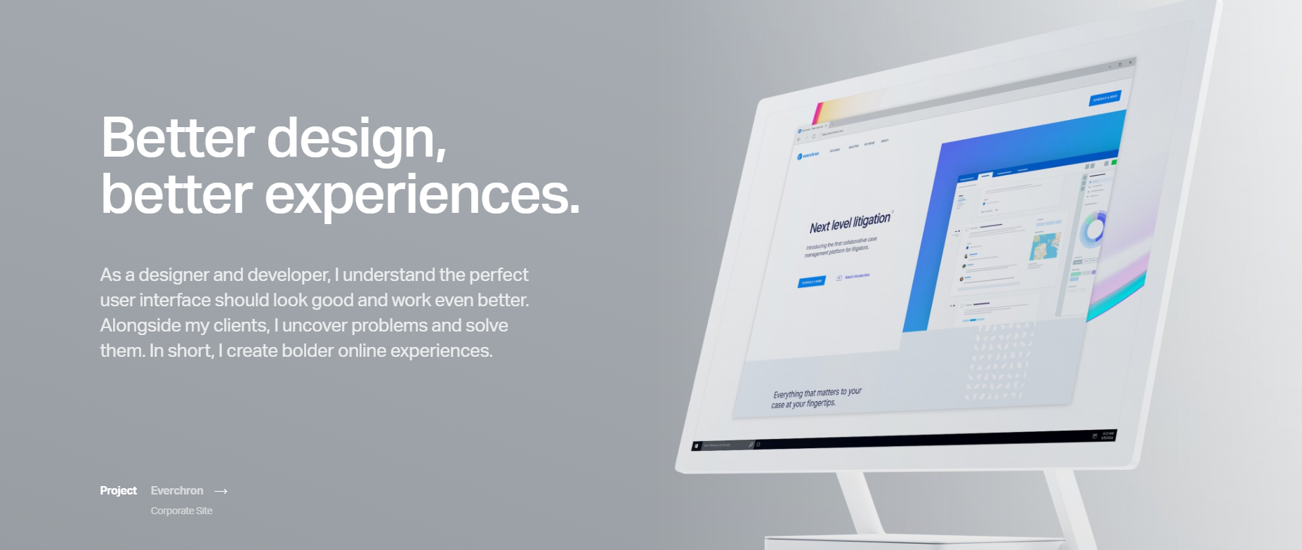
Ivo’s portfolio stands out for a few reasons, most notably is the use of client reviews and testimonials. Alongside the projects themselves, this helps make his work stand out.
Other than this, there’s a strong use of emphasized color and incredibly smooth, high-quality animations throughout. The use of color here (check out the contact page!) demonstrates an excellent understanding of visual hierarchy.
All of that’s before looking at each actual project, which is full of equally smooth animations, clear visuals, and a complete demonstrating of Ivo’s role in each project.
So What Makes A Great UX Portfolio?
As you can see, a great portfolio needs to do a lot. What these have in common, however, is their sense of honesty as well as confidence. They show the entire process, from research to creation.
“Some people think design means how it looks. But of course, if you dig deeper, it’s really how it works.”
- Steve Jobs
What’s more, they also treat the portfolio itself as an example. How a UX designer displays their portfolio also provides insights into how they work. At every step, they using their UX skills to guide the eye, encourage you to move through each study, and ultimately hire them for the next project.
If your UX portfolio leaves such impressions, you’re doing a fantastic job
